Saturday, October 29, 2011

Make It Mondays #38: Brayer Techniques

 It is time again for another Make It Monday Video, which can be found on Nichole Heady's blog for Papertrey Ink here:  Make it Monday Video.  This week, the technique is using an impression plate and then going over it with a brayer and ink to darken the raised areas and leave the impressed areas un-inked--is that a word?

I was inspired to use the woodgrain impression plate on Kraft cardstock, which reminds me of the wooden look and darker brown ink.  I ended up using Tim Holtz Distress ink, because it tends to give great coverage and blends well when going over larger areas. 

I love the way this technique turned out as I think it looks just like stained wood, which is perfect for the recipient of this card.  She has a lot of stained wood in her house that she paints folk art onto...so this is just her look :-) 

To go with the stained wood, I used the distressed pitcher with flowers coming out, because not only is she a great folk art painter, but she is also an excellent gardner and loves flowers.

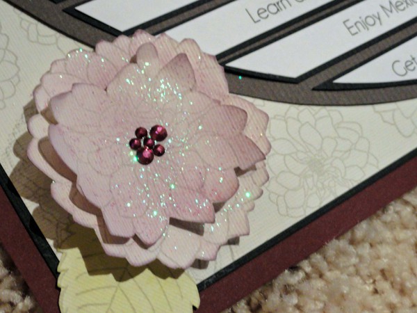
The Mat Stack needed a border inside, so I drew around the inside with a Sakura glitter pen.  That pen is one of my all-time favorite tools!!!  I also added a little glitter in the center of each flower.  To add dimension, I popped up the Mat Stack 3 die on dimensional adhesive.


Thanks for looking :-)

Supplies
Stamps:  Papertrey Ink - Iconic Images
Impression Plate:  Papertrey Ink - Woodgrain
Dies:  Papertrey Ink - Mat Stack 3 and Layerz Mat Stack 3
Cardstock: Paperbilities - Kraft; Papertrey Ink - Dark brown, Burgandy, Green
Ink:  Papertrey Ink- Vintage Cream; Tim Holtz Distress Ink:  Vintage Photo, Peeled Paint, Spiced Marmelade; Colorbox - Chianti
Glitter Pen:  Sakura
Twine:  Papertrey Ink
Rhinestone: Michael's

Monday, October 10, 2011

Baby Cards

I just love making cards for Baby Showers & Babies.  They always turn out so adorable :-)


Saturday, July 23, 2011

Summer Card Camp 2011 Week 4


Summer Card Camp 2011-Week 4


Two entries today!

I used a couple of stampin' up embossing folders for the background. Then I raised up a white sheet of cardstock with the corners rounded using pop dots. Lastly, I stamped white & embossed white banner flags, from Pennant Parade (Stampin' Up) and colored them in using Tim Holtz Distress Ink. They were very easy to cut out, because Stampin' up has a coordinating punch!!! Finally, I stamped the happy birthday sentiment on a strip of cardstock in black, trimmed it to look like a banner, and colored it with distress inks...added pearls & rhinestones, & done!

Love the clean look of both cards :-) These cards are more my style than the ones I've done on the blog.

Thursday, June 30, 2011

Another Week 1 Card


I love the background paper...just picked up a new SEI paperpad. It reminds me of a tropical sunrise. The stamps used were from Michael's $1 bin. The faux button on the bird was built right into the stamp...nice for keeping the card flat. The pink "string" was made by cutting an extremely thin slice of the raspberry cardstock. It worked beautifully. The clouds were cut out of glitter sticky back foam using Papertrey Ink's cloud dies. The border punch is Martha Stewart.

Thanks for looking :-)

Wednesday, June 29, 2011

Summer Card Camp 2011-Week 1

Nothing is more fun during the summer than camp. I'm so glad I get to participate in "camp"--a card making camp, that is this summer!!!

I decided to make a card with no inspiration other than this color combination from the Online Card Class that I signed up for this summer:


It was a difficult process and did not turn out at all. It is definitely not "my style" which seems strange, because I designed it...? But that's the thing with card making...sometimes you make a real winner...sometimes you don't ;-) Hopefully next time, it will turn out ;-) It's all part of the learning process!

Saturday, May 14, 2011

Make It Monday #14: Selective Inking


I always enjoy Papertrey Ink's Make it Monday challenges. It gives me a fresh idea for cardmaking each week.

This week's challenge is to ink up only part of the stamp to get a whole new look. On my cards, I used this technique to extend the length of one of the background stamps from the set, Background Basics: Retro.

Then, I used some of my new Hero Arts stamps to make a simple card with a bit of stickles on the background stamp. I just love how the Papertrey Ink stamps are versatile enough to work with other stamp sets and even sets from other companies.


Supplies:
All cards: Background Basics: Retro, PTI

"Have a Wonderful Day" Card:
Black Ink: Versafine, Tsukineko
Green Ink: Moss Green, Colorbox Chalk Ink
Pink Ink: Raspberry Fizz , Papertrey Ink
Fillable Frames #1, Papertrey Ink
Coordinating Die
Flower Fusion #1, Papertrey Ink
Tag-its #2, Papertrey Ink

Glitter Glue: Stickles, Ranger

"Thank You" and "Hello" Cards:
Congrats, Hero Arts
Ink Yellow & Grey: Studio G, Michaels ($1 bin)
Ink Raspberry Fizz (Pink): Papertrey Ink
Ink Black: VersaFine, Tsukineko
Glitter Glue: Stickles, Ranger, Papertrey Ink

Monday, April 25, 2011

Papertrey April Blog Hop Challenge


Yes, it's that time again...time for the Papertrey Ink April 2011 Blog Hop!!!

This month's theme was to make a card for the boys & men in our lives. I chose to make a father's day card for my dad, which will be here before you know it!


First, I stamped & heat embossed with clear powder the circle from Heather's Tag-Its #2 stamp set. Then, I stamped the bird house & sentiment from the same stamp set. This was die cut using Limitless Layers circle die...inked with dark brown, and adhered down with dimensional adhesive to give it a little depth.

I wanted to keep it simple, so I used a kraft card base. Once I realized that the card was waaaay too plain, I cut it down to be a square card...4 1/4" x 4 1/4". And since I remembered that Maile said on the PTI podcast that she rounds the corners when it seems like a basic card needs a little oomph, I tried the same. Then, I die cut the blue paper with the eyelet lace border die and wrapped some twine. Still not enough... I added patterned paper (yellow...crate paper)...still not enough. So I looked through my stamp sets for something that would go with a bird house and what do you know, Merry Little Christmas jumped out at me when I least expected it. You see, my stamps are organized in a binder and I was thumbing through the Christmas stamps as a last resort when it jumped out at me ;-)

Instead of having the birds hold a star, which doesn't tie in with Father's day, I used a heart from Love Lives Here. I cut it out and popped it up with dimensional adhesive.

Now the card is finished :-)

Thanks for looking!!!

PTI Products:
Love Lives Here
Tag-its #2
Merry Little Christmas
Button Twine
Limitless Layers Dies
Eyelet Lace Border Die

Sunday, April 24, 2011

Thank You Card for Baby Gift


Love the My Mind's Eye Stella & Rose Paper!!! I knew I had to make a card with it as soon as I saw it. I also love the new Spellbinders small series. To make the tag for the "Thanks!" sentiment, I used Labels 4 and Labels 4 small. The small is just the right size to nest inside of the original set of dies.

I also got to play around with some of the Michael's stamps. The banner stamp and the alphabet stamp that I used to stamp "BABY" on the brads are from the $1 bin. The Thanks stamp was one of the clings from the Studio G Ditto series. We are talking a very inexpensive card here!

The trickiest part was figuring out how to put BABY on the banner. I wasn't able to stamp the letters directly on the banner, because it has a black pattern on some of the flags. I also couldn't find my hole punch or I would have stamped it on small circles from that. So I pulled out some brads and colored them with a copic marker. I held them by the shank and stamped them with stazon ink. It was pretty easy, because the rubber alpahbet stamps are pliable and molded right to the curvature of the brad. Finally, I cut off the shank with wire cutters and used the tips to push down any remaining metal that was left over into the head of the brad. Then, I filled the brad with Glossy Accents and used that to adhere it to the banner pieces. Once all was dry, I stamped the ties (TE) and drew in the line with an American Crafts Slick Writer (Love those!!!).

Supplies:
Banner, Alphabet, Thanks! Stamps: Studio G, Michael's
Banner Tie Stamp: Taylored Expressions
Patterned Paper: My Mind's Eye Stella and Rose
Cardstock: Pink - Papertrey Ink; Yellow - Bazzill
Light Pink Ink: Stampabilities
Black Ink: Stazon, Tsukineko
Dies: Spellbinders
Ribbon: Craft Supply

Tuesday, April 19, 2011

Make It Monday #11: Embossing with Dies

I just love the challenge that Heather posted today on the Papertrey Ink blog.

She did such a great job making the clouds in the sky very dimensional. I decided to make dimensional circles on my card, but had to do it a little differently, because the buttons are not separate dies. So I used the dies to punch buttons out of PTI coasters (you can get a ton of buttons out of each one and the whole pack of 25 is only $1!). To keep the buttons in place, I applied removable dot adhesive to the back of the card and stuck the buttons right on before running it through the Cuttlebug.

I used 2 B plates and 2 tan mats and the sandwich seemed to give a deep impression.

After embossing, I attached raspberry fizz cardstock that had been punched with a Fiskars scallop punch. (I did it in this order on the second card that I made. On the first card, I attached the pink scallops before embossing and it left an embossed line embossed across the bottom of the green cardstock, so I had to redo it...craft & learn).

To make the embossed dots white, I used a dauber from Tsukineko and some white Colorbox chalk ink. I pieced the bee together by cutting out a few ovals with my Silhouette and the bee wings are made of a piece of baby blue vellum that I punched out with a heart punch and rounded the bottom with scissors. After all was assembled, I adhered the bee head with dimensional adhesive to add dimension, drew on the face with a black marker and Sakura Glaze pen, added the antenna and freehanded the heart trail. Finally, I went back with a white pen and drew in faux stitching.

Here is a detail shot of the bee:

The finishing touch was the sentiment which I printed out using the FREE Little Days font from www.dafont.com.

This was my first paper piecing...lots of fun to think up and put together :-)

The final product:

Thanks for the inspiration, Heather!!! Thanks for Looking :-)

Oh, the Places We'll Go!

Our daughter was born. I was a new mom. I had no idea what I was doing...
When my mom and Jim left and my husband went back to work, it was just Addison and me. I had to learn how to take care of a baby and figure out what activities we could do...could we do any activities together? She didn't talk, do anything with her hands, look at me, or anything that would come close to communication between us. I made this layout with the thought in mind that eventually babies come to communicate, they grow up and we will be able to play, eventually. I'm not sure why I thought she would be born able to communicate; I guess I just hadn't thought it through ;-) This layout is a list of some of the things that I look forward to doing with her after she is out of the baby stage (and by then, I'll probably be wishing she was still a baby...).

The design of the layout is based off of the necklace that I am wearing in the picture. I used the different shades of purple to match up card stock and rhinestones. The clustered rhinestones remind me of the clusters in the necklace.

Here is the original layout...


Then I thought it could use a background page to it and a few more accents...


Detail shot of the butterfly (large - Hero Arts; small - Stampabilities)... I stamped it in black ink and embossed it with clear embossing powder. Then, I applied the concord & peeled paint distress ink to color in the purple & green. Finally, I applied stickles to give it a little sparkle.


Detail shot of the stamping...I stamped in flowers in grey (stamps from Papertrey Ink) behind the flower on the lower left corner and behind the focal photo on the upper right. I cut out and sponged color onto the flower. I popped it up with dimensionals and added rhinestones. All rhinestones are from Jolee's Boutique. The handwriting stamp is Technique Tuesday (Ali Edwards).


Thanks for looking :-)

Monday, April 18, 2011

Welcome to My New Blog!!!

I'm so excited to start a blog that is dedicated to paper crafting only!!! I've been blogging since 2006, but it has been about everything from life to cooking and of course, scrapbooking & card making. Now I finally have a blog just for the love of everything paper!!!

You might be wondering about my style...I would consider my style to be modern and elegant. I like to dabble in other styles, but you will always find clean lines and trendy color combinations in my work. In fact, I am looking forward to this blog to define what my style is, exactly. I follow lots of blogs and one thing that I find in the best of designers is that they have a signature style that is their own. I have a moderate feel for my own style, but I want to more clearly define it, and I am looking forward to doing so with this blog.

I have been scrapbooking since my early college years (about 10 years ago) and yes, I had the decorative edge scissors (still have some) and punches... I even still have my coluzzle and some of those MAMBI large sticker sheets that smelled so good...those of you who have been around since the beginning of scrapbooking know what I'm talking about ;-)

I used to own a scrapbooking kit club for about a year, which I sold to focus more on my career & family. I also started up a wedding invitation company where I designed and assembled custom wedding invitations called Studio H2O, which is what this blog is named after.

Looking forward to sharing lots of ideas right here on this blog and hopefully making some friends who love to craft along the way!!!